Italic Questions and Answers
Nancy Winters
In this short article my aim is to endeavour to show certain aspects of teaching an italic hand, which I have always felt need special emphasis and while being obvious to many teachers, might be of help to others who are willing to teach it.
In emphasising these aspects perhaps they will also serve as reminders of what is considered to be good practice for would-be italic writers.
The first, most obvious, and least difficult point is that italic, whether written or printed, is based on a sloped oval o, that gives the style its desirable cursive quality and characteristic form. This slight slope to the right presents no problems to young children, young people or adults, except possibly to just a few left-handed writers who, in spite of their efforts, have to settle for an upright hand. Five-year-olds can make an oval o more easily than a round one and have no difficulty at all.
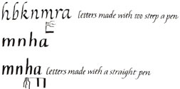
Problems arise, particularly for adults, when they have not spent enough time on the two very basic exercises which are necessary for emphasising the family likenesses of letters and which lead so easily to writing nearly half the letters of the alphabet without any trouble. They are the rhythmical practice of clockwise and anti-clockwise arches.

These two exercises, when practised regularly and often, ensure that 'narrow bend' ligatures will lead from letters such as  and that there will be 'narrow bends' in the base counter of
  and narrow arches in
  If time and attention is given to these in the early stages then spikiness, an unattractive feature, and illegibility can be avoided.
Young people, of course, do not use pens so they are free from the problems of maintaining a pen angle of 45° to the writing line. It is this angle which establishes an oval o, the clue to the italic style. On first taking up a pen it is important to practice making a zig-zag pattern with fine up-strokes and broad down-strokes, the extremes of the pen's range.
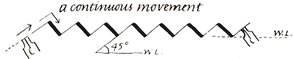
Again, it cannot be stressed too much how importanr this is and if done well and often, perhaps at the beginning of every writing session or on a doodle-pad at coffee-time it will not be difficult to achieve a constant pen angle, thus avoiding future problems. It is often when this constant pen angle is lost, (for instance when the pen has been held at too steep an angle to the writing line) that we see letters with thin downstrokes, heavy shoulders and some heavy horizontal joins. Problems also occur when the pen has been tumed too much in the other direction so that it writes an extremely broad down-stroke — a straight pen hold — giving letters a gothic appearance.
Much practice needs to be done on joins so that in a short space of time, and with concentration on appropriate words, they will become automatic. It is very easy and quick to join from a two-stroke e, care being taken to re-trace part of the loop of e on the up-stroke to link with the next letter, thus avoiding a straggling link stroke. For those writing with a chisel-edged pen held at an angle of 45° to the writing line this will not be difficult as the linking stroke is on the fine sidled up-stroke.
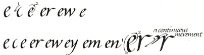
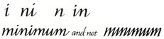
The horizontal join from the top of o, from v and w and from the cross bars of t and f need careful practice at first. It has to be remembered that the bars of t and f lie in line with the tops of the small letters and that t is a short letter. I think it is best, in the interest of legibility, to leave r unjoined. An r linked to an i could look like an n and an r linked to an n could look like an m.
It is also worth noting here that it is a help, when using the natural diagonal join, to observe how the letter that it is leading into begins, and a link made accordingly. If a diagonal join has to lead into an i then it can join up sharply, but if into an n then the link is a continuous curve or 'narrow bend.'
Italic is a very functional, everyday handwriting style and should not, therefore, be reserved for special occasions. It can be an elegant hand with ascenders and descenders about two and a half times the height of the miniscules which are started and finished with a pushed right to left stroke. When writing faster, ascenders tend to become shorter and undecorated. This does not matter too much because it is the shape of the letters which conveys the essence of an italic hand.
Whilst it is a good thing to practice with a fairly broad pen so that the letter shape can be seen clearly, it is important to realise that smaller writing can only be achieved by writing with a narrower pen. This does need to be pointed out to children in particular, but also to adults, and it can best be done by a demonstration of how letters written on too small a scale for the size of the pen become angular because they have not 'enough room to turn round in.' Smaller, everyday handwriting will require a smaller, narrower pen. The italic hand can be written equally well with a pencil, biro or felt pen and it is not an essential prerequisite to use an edged pen. The style is enhanced if a pen is used but everyone should be encouraged to use other writing implements. Trying a variety of 'tools' can give enormous pleasure during a course of leaming to write.
Capital letters are often written too large and when used with an italic cursive, look best if they are less than twice the height of the minuscules. They can be quite plain or more decorative 'Swash' letters. It helps to spend some time, even at a basic level, on studying the classical proportions of capital letters so that when writing an M or a W, for example, it can be remembered that these letters are the widest in the alphabet and written accordingly. Similarly, it should be noted, that B, E, F, for example, are narrow letters. Capital letters are worthy of having more time spent on them.
These then, are some of the things that I try to emphasise in my teaching and I really do believe that if the basic exercises, i.e. the zig-zag, the clockwise and anti-clockwise arches, are done regularly and often in the early stages, the problems of bad letter-shape and angularity can be avoided and a good italic hand easily established. It will then be a joy to write with good letter shapes maintained even when written fast. Practice need never be dull and boring if enough varied combinations of letters are used to illustrate a specific purpose — there are a lot of words with clockwise arches in them!
So mind your p's and b's and your n's, m's, r's, h's and k's!